
Salt Lake City’s restaurant scene has never been brighter or more vibrant. And not only are our lovely local restauranteurs taking their food seriously, but many restaurant owners understand the importance that design plays in their guests’ overall dining experience. A restaurant’s design begins to mold a guest’s experience and perceptions long before a plate of food even hits the table. Design is a visual appetizer.
Heirloom, fresh, clean, organic, simple, local. I wouldn’t blame you for thinking that these words are used to describe food. You’re not wrong. But these are the same words being used in the context of restaurant design throughout Salt Lake.
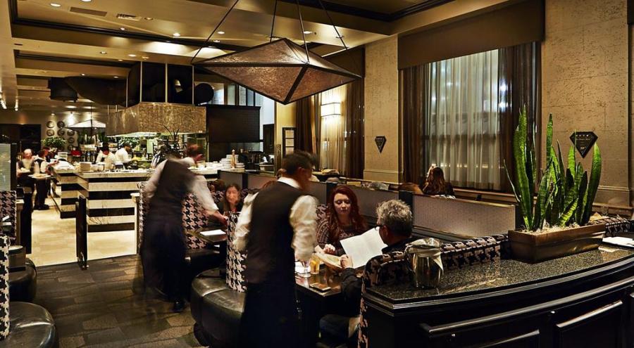
I remember the first time I walked into Bambara restaurant: striking black and white was balanced by warm browns. Contrasting tiles and stonework, textured houndstooth seats, and beautiful fixtures evoke a sense of class, and hearkens back to the “good old days” of downtown metropolitan business and banking. The restaurant’s design pays homage to the building’s heritage as the Continental Bank, before it was converted to the Hotel Monaco. Staff circulate efficiently through and around the large, open kitchen (before open kitchens were really even a thing). Bambara’s design is contemporary, classy, and all business. Just like its food. This restaurant has been around for a while, but they knocked it out of the park with the design, and it is just as fresh as day one, in my opinion.
A restaurant’s design, when done right, complements the food. Andrea Beecher of M3LD designed the striking new Table X restaurant, which used to be a cheese factory in Brickyard. Beecher and the Table X owners were able to preserve much of the original elements of the building in order to preserve character and pay homage to the building’s history. When asked about her design inspiration for this unique space, she said:
After having eaten the chef’s food and being inspired by how bright, fresh and vibrant it was, how much of a piece of art every dish was, I thought about a trip to Iceland that I took a couple years ago. I was there in summer where layered on top of what is typically a barren landscape of black, grays and browns, there are colorful wild flowers of all kind and the greens of grasses and moss. The monochromatic landscape allowed these seasonal touches to pop in a huge way. I thought of their food as that foliage and wanted the restaurant to mimic Iceland’s landscape so their food would pop just the same. So their food could be the art in the space. Be the highlight it should be.
I.e. restrained design focuses attention where it should be: on the food. Design sometimes needs to know when to get out of the way.


One common denominator amongst restaurants leading down the design path is a focus on textures, and the impact that different materials have. A reinvigorated design focus around various textures complements many chefs’ approaches to a multi-faceted dining experience.
Even hot dog places understand the interplay of restaurant design and the overall guest experience. For those unfamiliar, J Dawgs is a hot dog shop that started as a tiny little shack on the south end of the BYU campus. It has since grown to five locations (four in Utah County, one in downtown SLC).
Immediately upon entering the space, one recognizes the thoughtful approach that the owners took in designing the space. In fact, J Dawgs hired Rapt Studio, a design firm that has worked on projects for Adobe, Google, Apple Youtube, and HBO. Rapt worked with J Dawgs to redesign their brand, and to design their Salt Lake City location with the goal of creating a space that was reminiscent of the original hot dog shack in Provo, but with a more grown-up angle.
Communal tables are intermixed with single seats, counter seating, and a lounge-type area with a TV towards the back of the shop. A giant wall installation utilizing bottles of their signature sauce form a giant American flag. Corrugated steel is tastefully installed to hearken back to the original shack. And the centerpiece of it all is an open kitchen, where guests are afforded a 360 degree view of the entire cooking and dog-building process.


Mollie & Ollie‘s clean design, while it may be viewed as overly sterile or antiseptic by some, also reinforces their focus on “clean” foods–those that are simple, organic, and responsibly sourced. M&O owners invested a small fortune to completely renovate the very long but skinny footprint that stores on SLC Main Street are famous for. I personally enjoy the clean, simple nature of the space that allows diners to focus on what really matters: the food, and the people you are enjoying the food with. I also applaud Mollie & Ollie for realizing that it’s ok to be brave with design (and yes–white is brave). It’s refreshing to walk into a space and not be bombarded with Edison bulbs as far as the eye can see. But I wouldn’t blame you if you felt like you were in an operating room.


The LaSalle Group took things down to very core (literally) with their renovation of the old Baker Motors building on 3rd South in Salt Lake in order to house the new Current Fish & Oyster. The old car dealership building was in serious need of updating, so the owners went in, gutted the place, and started with a clean slate, while preserving the exterior of the building. LaSalle did a similar gut-job renovation on the old Faustina place in order to create the deliciously clean Stanza Italian Bistro.


Rich, vibrant greens cast a striking, yet comfortable contrast with the grays and whites in the newly-opened HSL. HSL, the second restaurant venture of Chef/co-owner Briar Handly, partnered with real estate and design heavyweight cityhomeCOLLECTIVE, who were involved in designing numerous striking restaurants in the city, including Pallet and Finca. When you enter HSL, you are immediately hit with the impression of life, warmth, and vibrance.
“Melissa (HSL co-owner of HSL) and I talked for a long time about what we wanted HSL to feel like. Where would the magic be? We knew that we wanted patrons to walk into a space that felt alive and conscious…like it had a soul of its own.” -Cody Derrick, cityhomeCOLLECTIVE
So much of Handly’s expertise lies in his ability to raise vegetables to be on par (or many times, exceed) that of the protein, typically the star of the show. HSL’s design, centered around vibrant green plants, complements his approach.
“We tried to create a space that feels the way Briar’s food tastes. We wanted the design to be interesting, calming and comfortable. To evoke a sense of nature. Design is a critical component to the guest experience. We believe that for us to be successful we need to have a equal balance of food, service and ambiance. That being said, it doesn’t matter how good your design is if your service and food aren’t exceptional as well.” -Melissa Gray, co-owner
Design is a seemingly endless proposition, framed by finite resources. Budgets limit choices, restaurant layouts limit designs, and city codes can restrict design freedoms. But that challenge brings opportunities.
“There is something I’ve learned to be true in all aspects of design: convenience kills creativity. When you’re given the world–too many choices, an endless budget, no timeline–some key part of the process inevitably gets lost. Perhaps it’s our innate desire to be problem solvers, or our constant inability to be satisfied, but designers and artists in most any capacity seem to thrive in an environment laden with obstacles.” -Lauren Bald, cityhomeCOLLECTIVE, regarding the challenging FINCA design project
Cody Derrick continues:
“We’ve gotten to create a space where we’re inspired to be. It’s something that’s never been done before; something that’s inspired by the space itself. It’s inspired by the food and the chef, the owner, the locals. It’s inspired by all of that, but it’s still here. It’s in Utah. Which is why we have mountains on the walls, and locals in the photos. It’s not trying to be anything other than what it is. Finca is a Spanish restaurant in Salt Lake City, so let’s just celebrate that.”
Indeed, that’s what proper design should be about. It should be inspired by (and should celebrate) the surroundings. Reflect the nuances, talents, and quirks of the chef as well as the food itself. A properly designed restaurant should not distract guests from the meal, and should in fact be the platform upon which the food is allowed to truly shine. Design should be a quiet element of the dining experience, shaping, but not intruding on a guest’s experience. Design should celebrate the personalities of the staff and guests, and make all feel welcome and free to enjoy themselves.
Design is expression.
